My favorite logo is the
Target logo, because its simple color composition of red and white stands out. I also like how it is a play on words of the brand name,
Target, since its logo is an actual target.
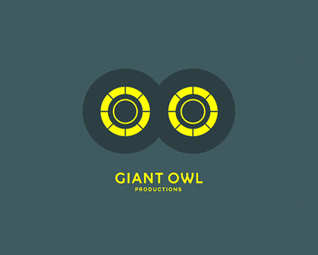
I enjoyed the aesthetic of
Giant Owl Productions, because the eyes is similar to that of an owl and the revolving disks as eyes portray their purpose as a production company.
This logo was aesthetically pleasing, because of the neon and pastel colors such as green, pink, orange and blue stood out. I also liked how the company name was incorporated in its logo not only because it is a letter mark, but because it also literally included 38 dots.
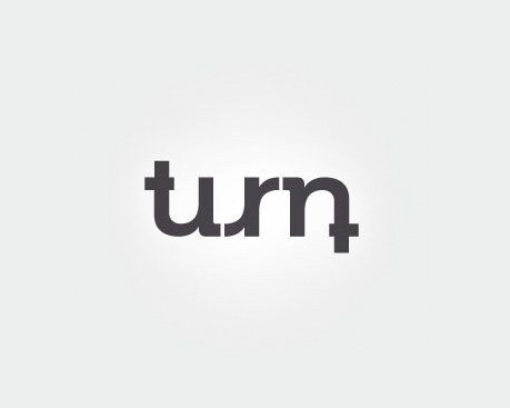
I liked the
Turn logo, because its logo literally turns similar to the company's name. The rounding of the letters have a very friendly appeal and its logo is very cleverly designed in that when turned upside down, it would look the same.
I liked the blue bird, because the colors make the bird aesthetically appealing. The choice to ombre blue colors makes the bird standout.
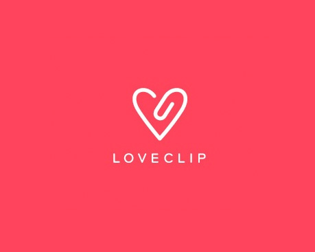
The
Loveclip logo stood out, because it showed the love in a shape of a heart and incorporated the 'clip' part of the company's name in the logo. The background color contrasting with the white also emphasized the logo.


Wow Liana amazing job on this blog post, I'm gonna be reading this one every morning when I wake up. I also noticed that you like logos with circles in them, maybe that says something about you who knows?
ReplyDelete